 07808 168 543
The Book of Me
 This year, we have looked at plants, animals, our friends and fellow classmates, so now it’s time to focus on me, myself and I.
Our quest: To answer “Who am I?” in a book, through expressing our feelings, thoughts and ideas in a way that celebrates the wonder of our individuality. Each one of us has our own visual language through our mark making and that’s ok! In fact, it’s better that ok, it what makes our art stand out.
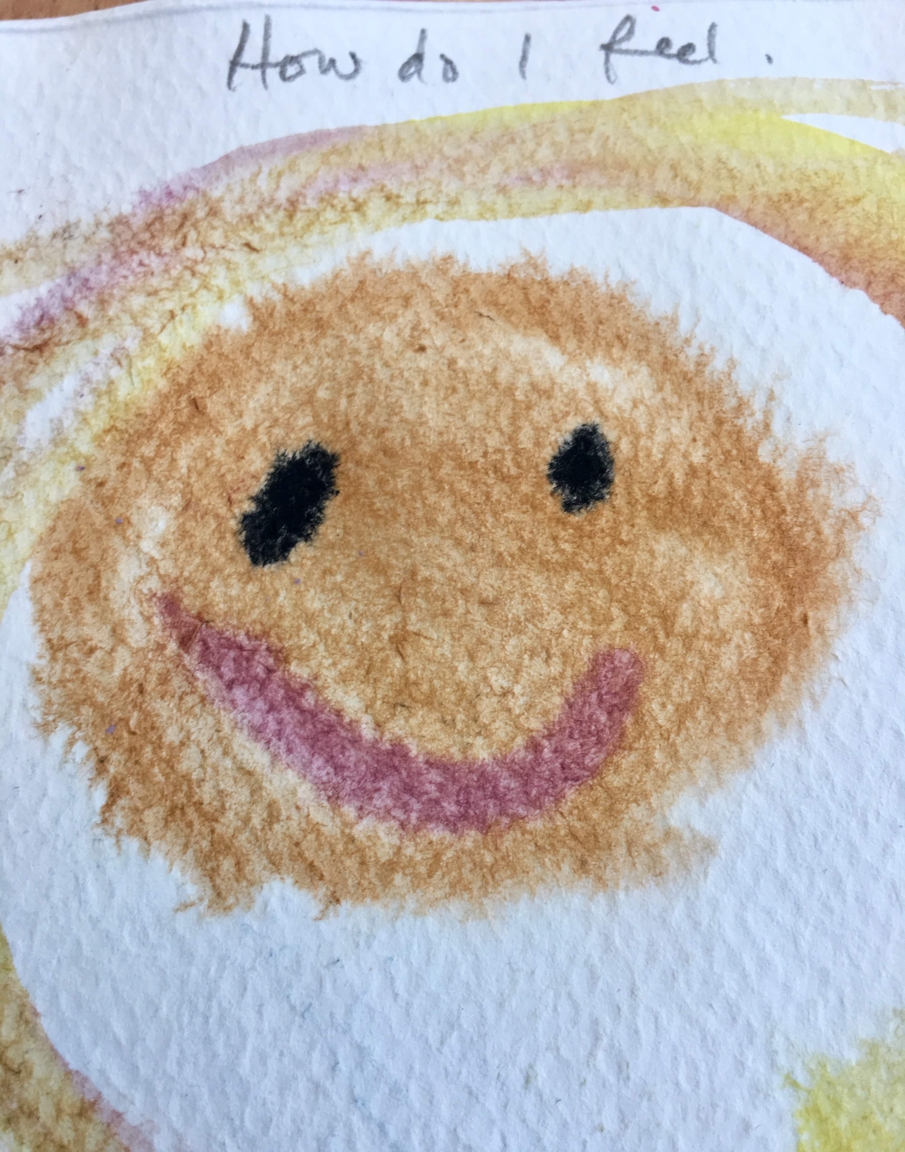
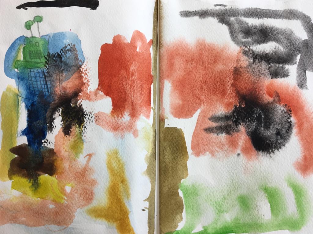
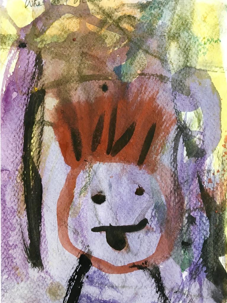
 We worked in watercolour paints on weighty, dappled watercolour paper, that was fastened into an A5 book. A question headed each page, to help prompt inspiration, e.g. Who do I love? How do I feel? Where do I go? What do I like to do? Where do I start?…
The challenges, when using watercolours, are many. The paint dries quickly, the colours merge, the colours may not come out as planned, perhaps too pale, too runny…help!
We need to tackle this medium and understand it’s limitations. Watercolours are great for their soft edges, for building layers, bleeding colours together, creating loose organic shapes and to achieve this we must let the paint have it’s own ideas about where it wants to go by swooshing swirling eddies on our pictures.
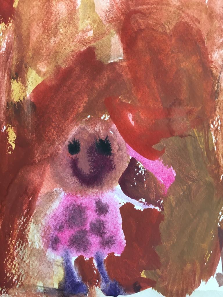
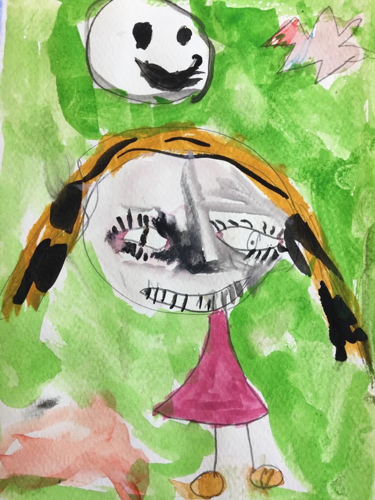
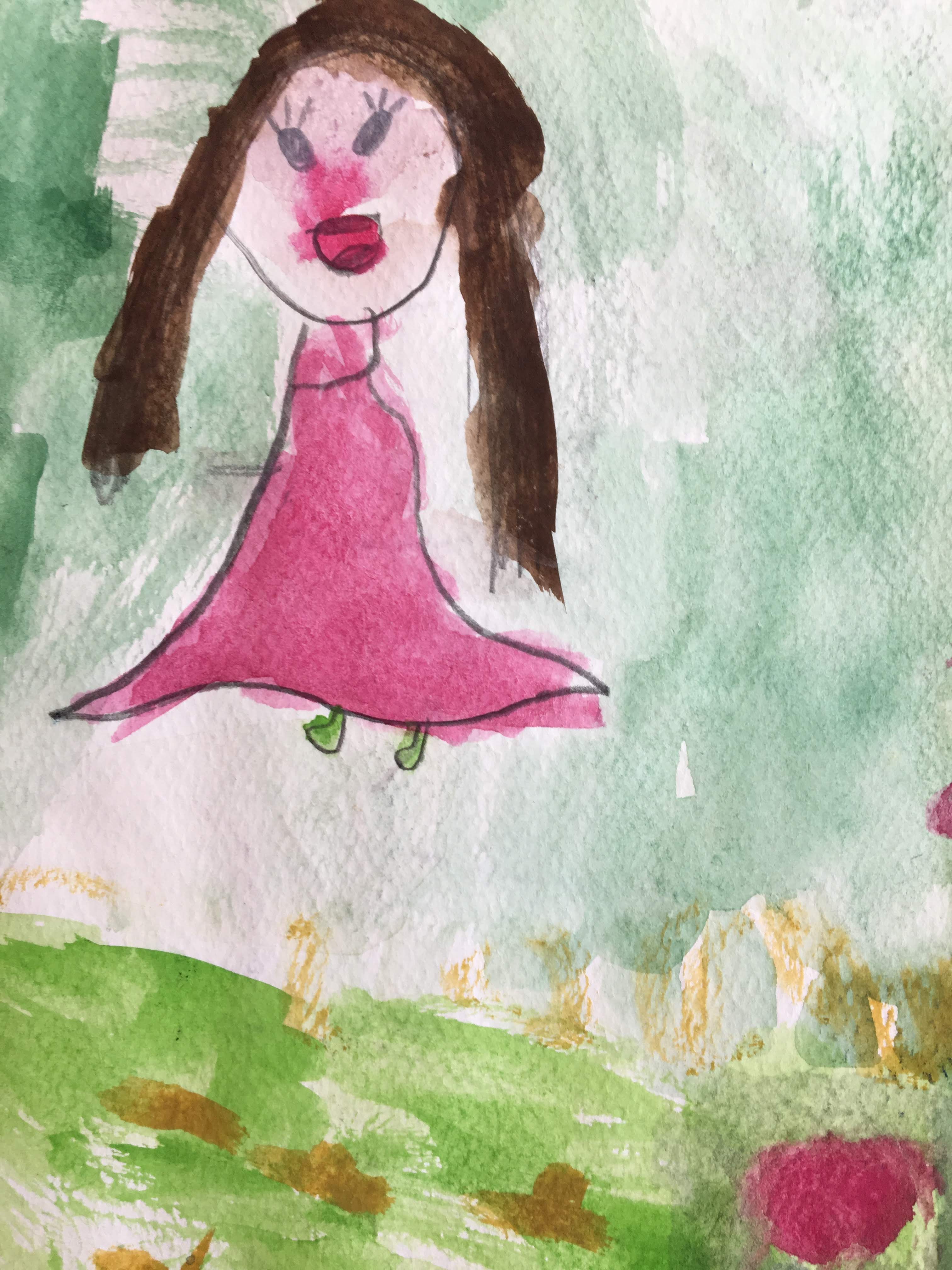
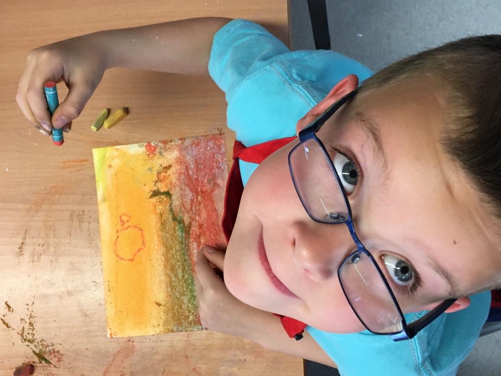
Armed with a tin of paints, a large and small paint brush each we were able to allow broad strokes for the large spaces and small ones to bring out the finer details, such as eye lashes, like these beauties below!
Learning how not to “colour in” our drawings, but to let the painting evolve was our goal.
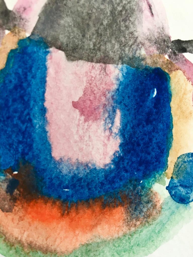
 We encouraged the painters’ to experiment with colour mixing, which is amazing because it really brings out different personalities. Look at these stunning subdued tones and bleeding colours.
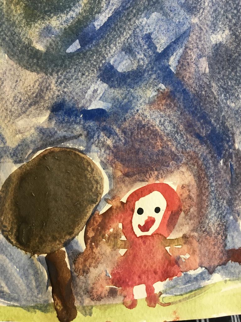
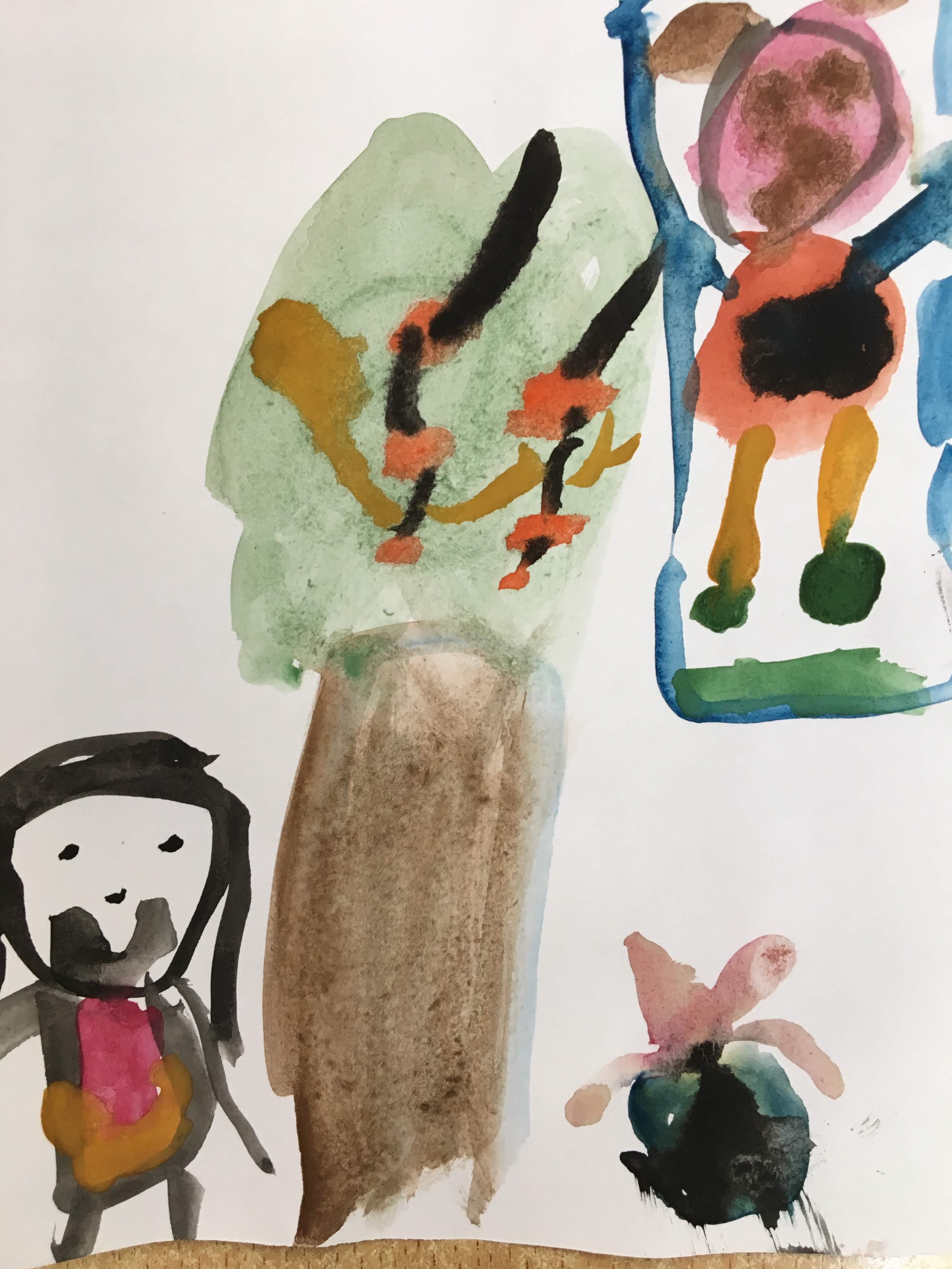
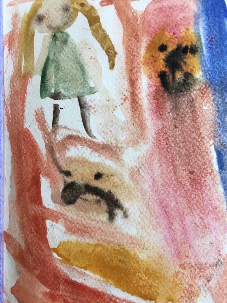
 This artist chose to leave the bed and character simple and plain, to accentuate the daydream. See how they used proportion to express the enjoyment of eating a hot dog and chips!
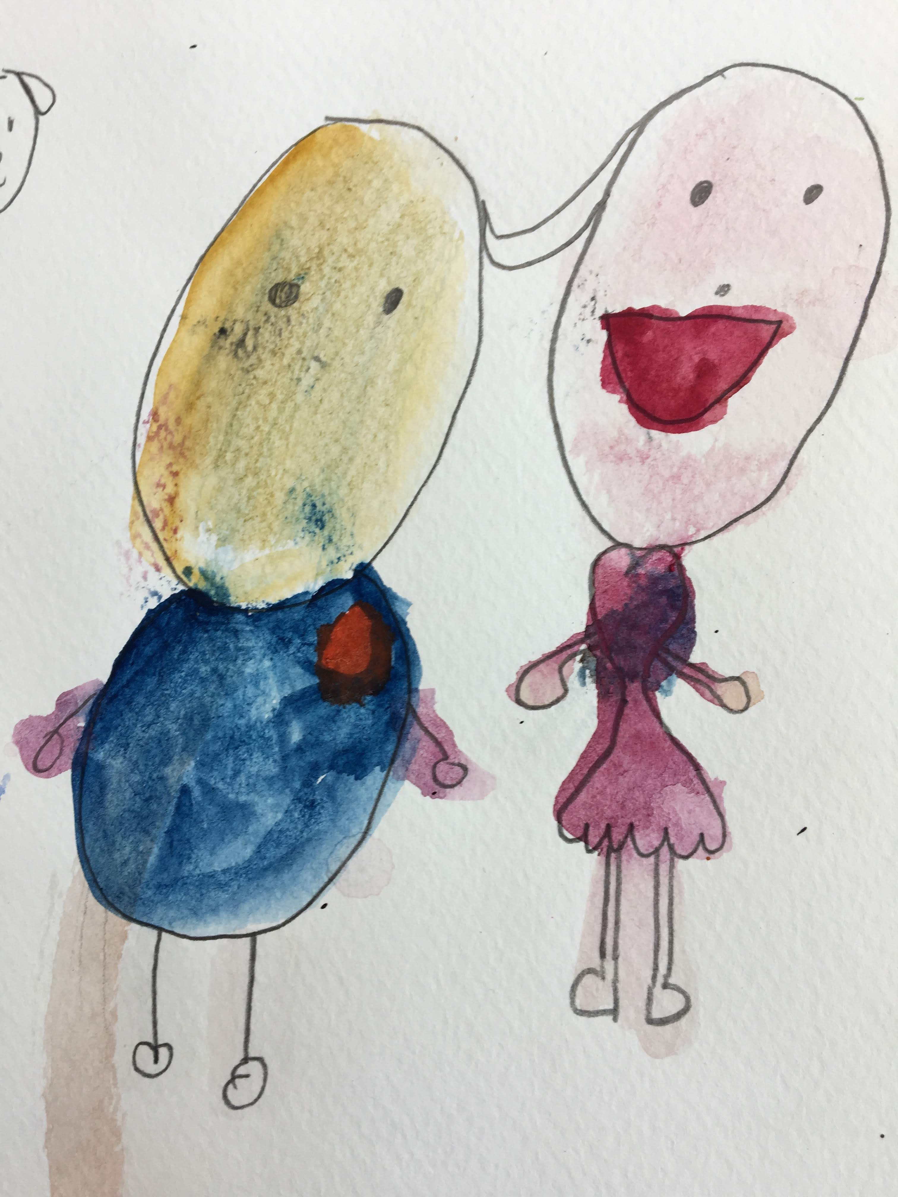 Mixing skin tones and learning to layer colours, makes these characters come to life.
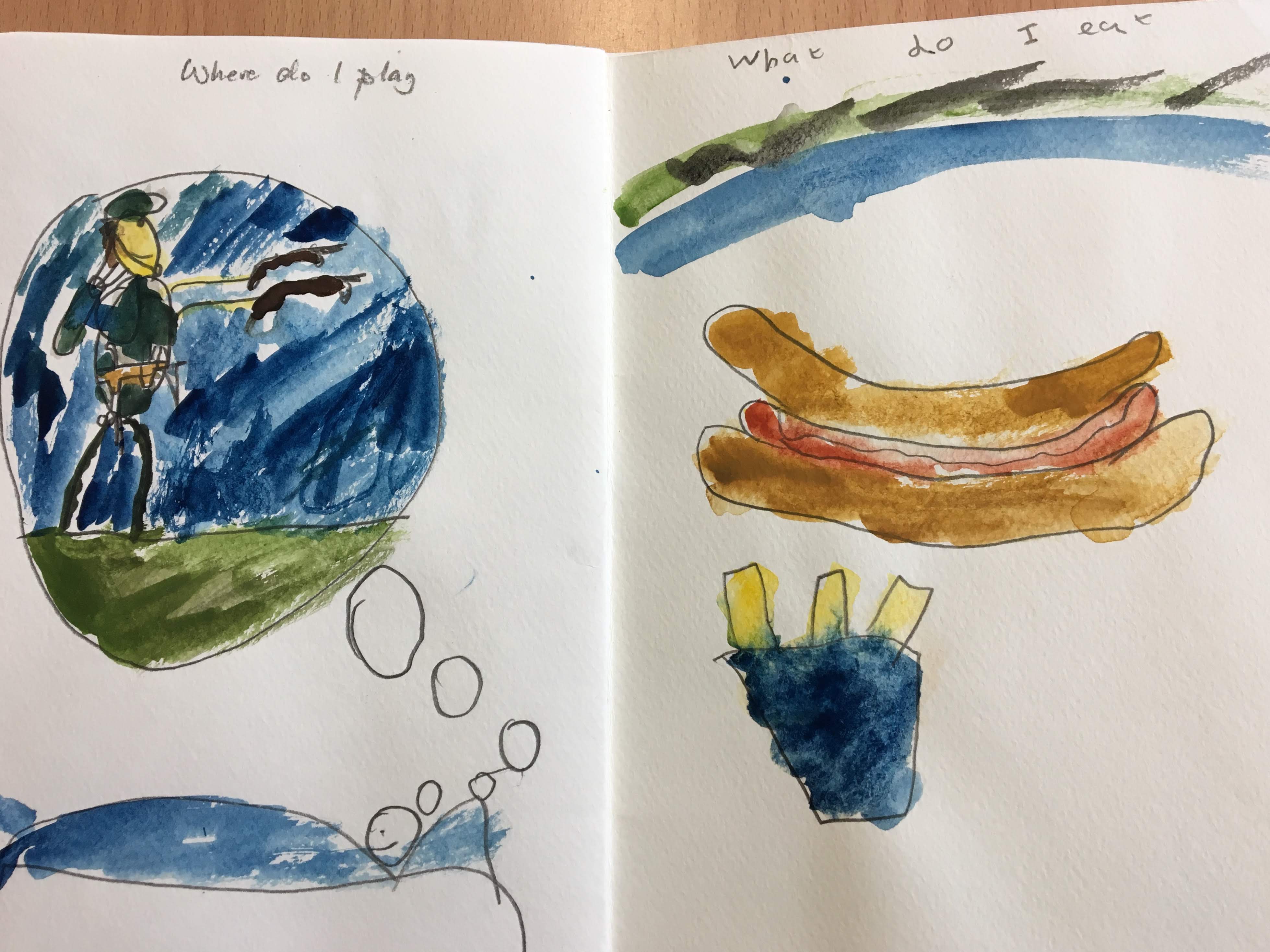
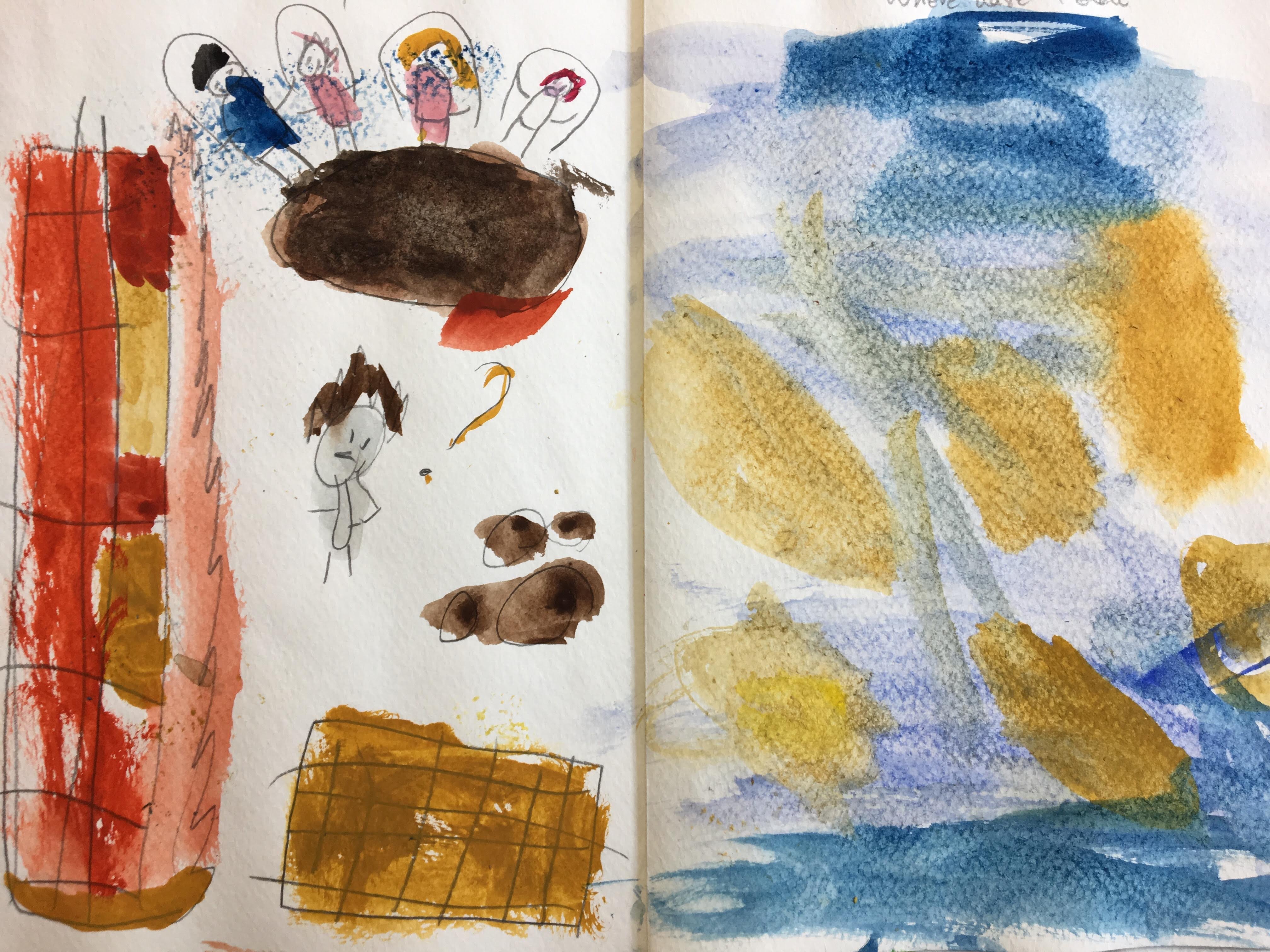 Here we are in the playground; what shall I play?
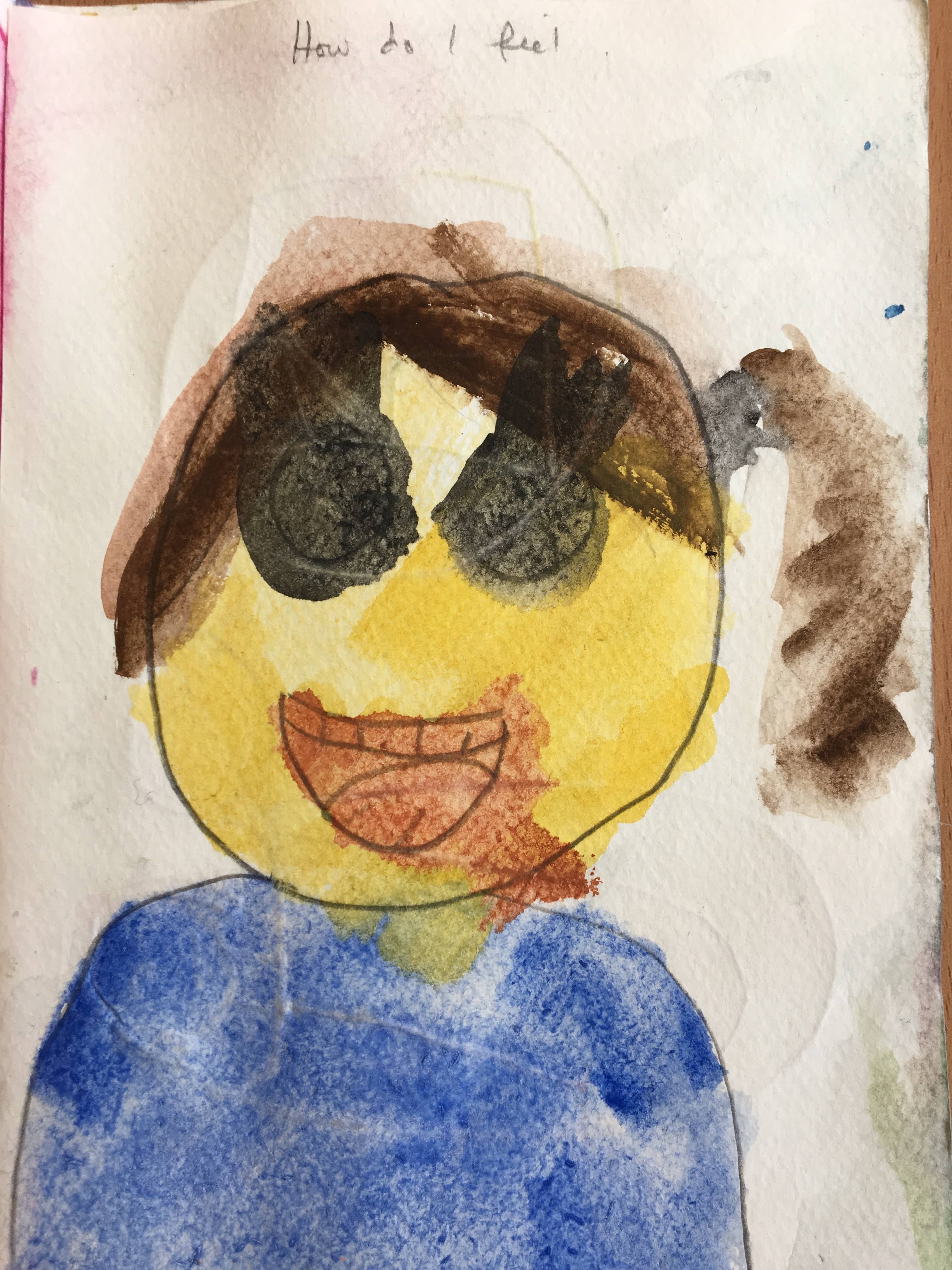
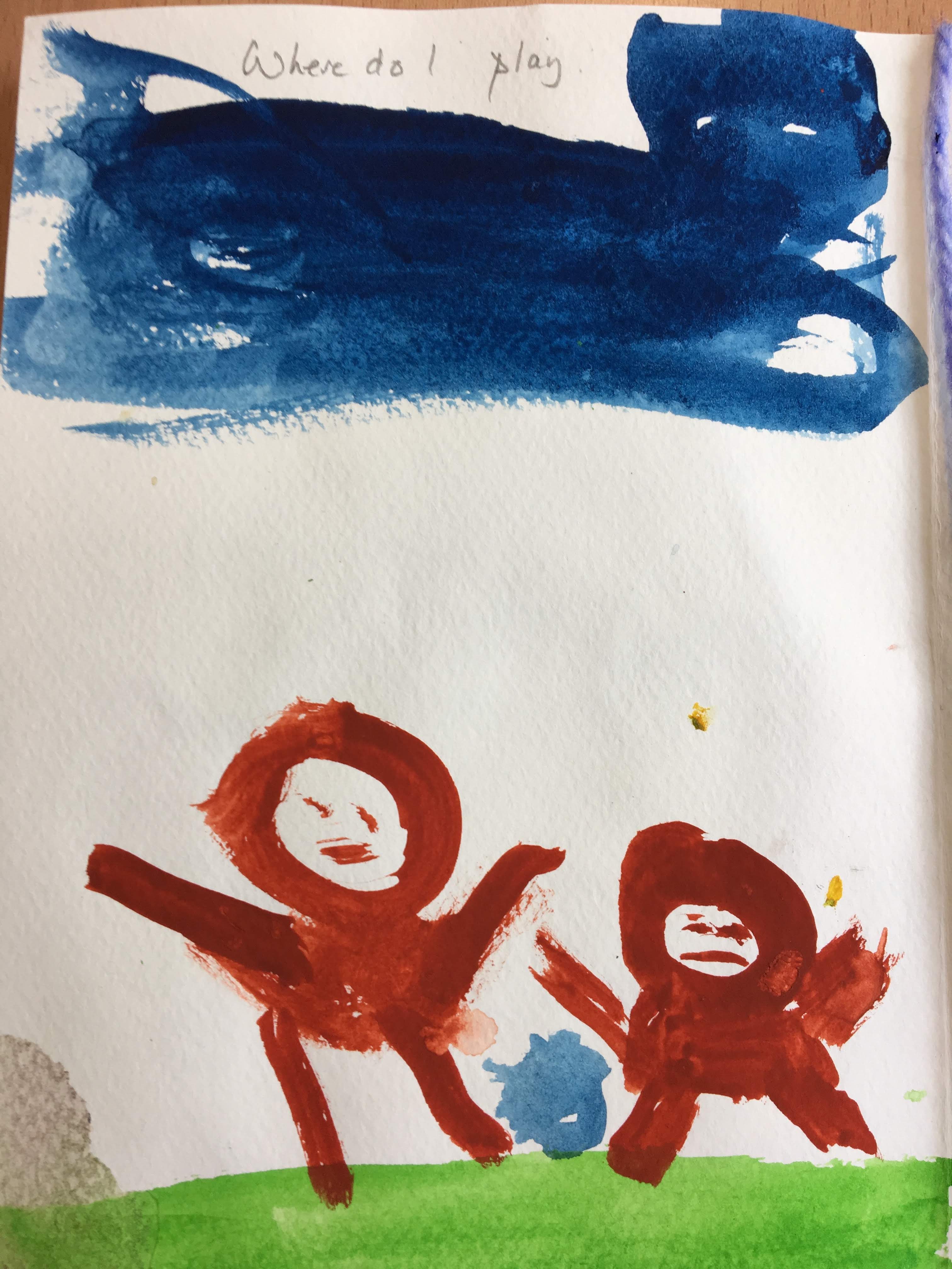
 Through short demonstrations, the children were able to see how to let the paints work on wet paper, a technique we have learnt this year, wet-on-wet.
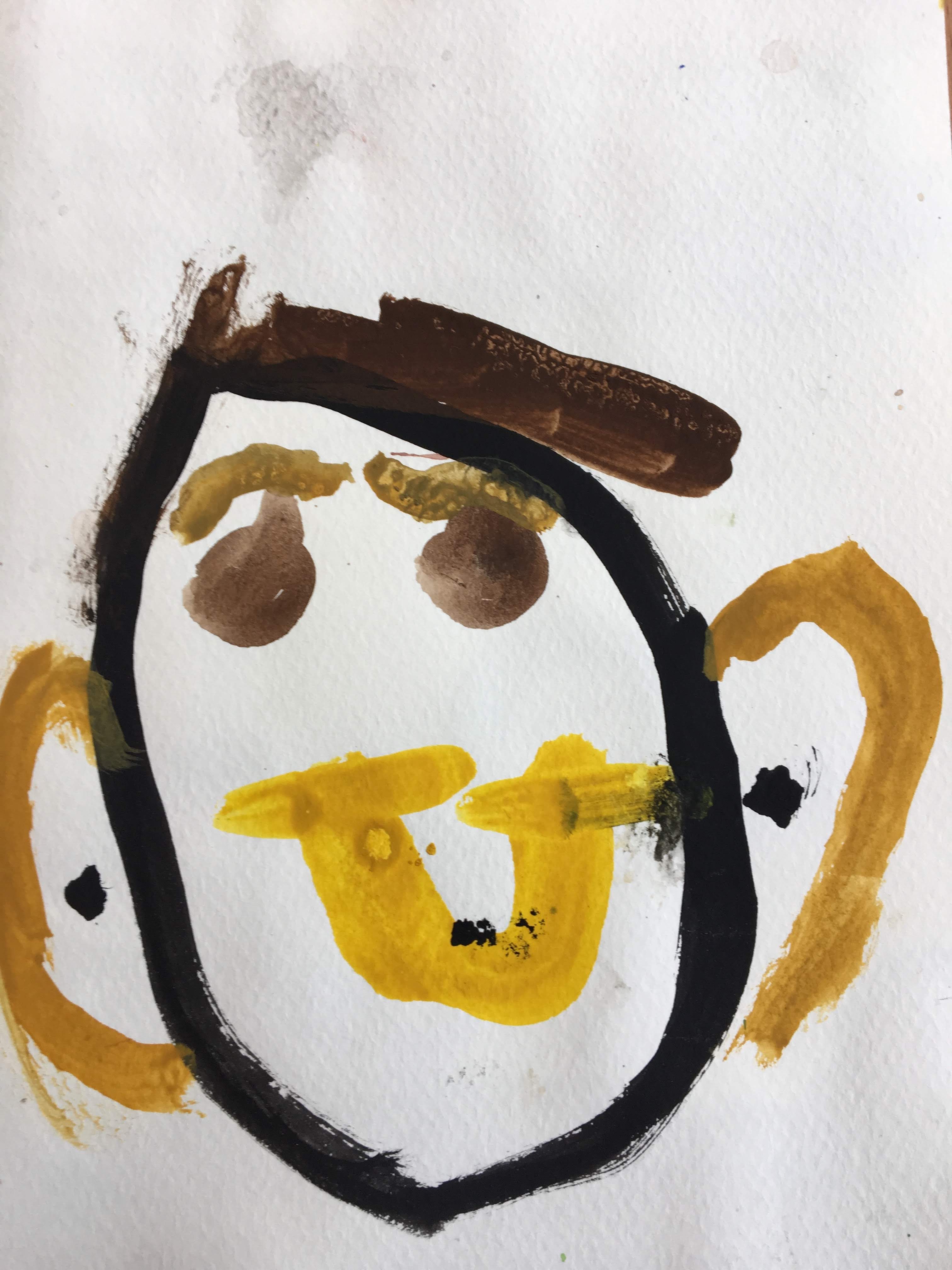
 The painters’ built up layers of paint, to create complex and individual illustrations. Through a little bit of trial and error, we learned quickly how to keep the colours fresh, when to change our water and when to allow the surface of the paper to dry, before continuing, so as not to overwork the paper or spoil the delicate bleeding of the paints as they merge together to create soft patterns on the page.
 To prepare for and approach each page of our book as a painting in it’s own right, we did some drawing and painting exercises based around ideas of composition, by looking at a wide variety of art works throughout history.
To begin with, we looked at a group of paintings that show out of proportion elements, such as Andre Derain’s “Portrait of a Man with a Newspaper”, Dorothea Tanning, “Eine Kleine Nachtmusik” and Fernando Botero’s “Dancing in Colombia“.
 Aside proportion, both in and out, we studied some artworks that focus on scale. Looking at images of big, small and heirarchical scale works of art taught us how to express our subject matter in terms of priority. This leads our viewer’s eye to where we want them to look, by making aspects smaller or larger in the context of the surrounding content. We discussed small scale “Jade Mountain“, “A Bowl of Taipei” by Yang Yongliang and the fascinating “Tiny Worlds” by Tatsuya Tanaka. And we discussed large scale, “Oriental Poppies” by Georgia O’Keefe, Nazca Earth Drawings, “Spoonbridge and Cherry” by Claes Oldenburg and Coosje van Bruggen.
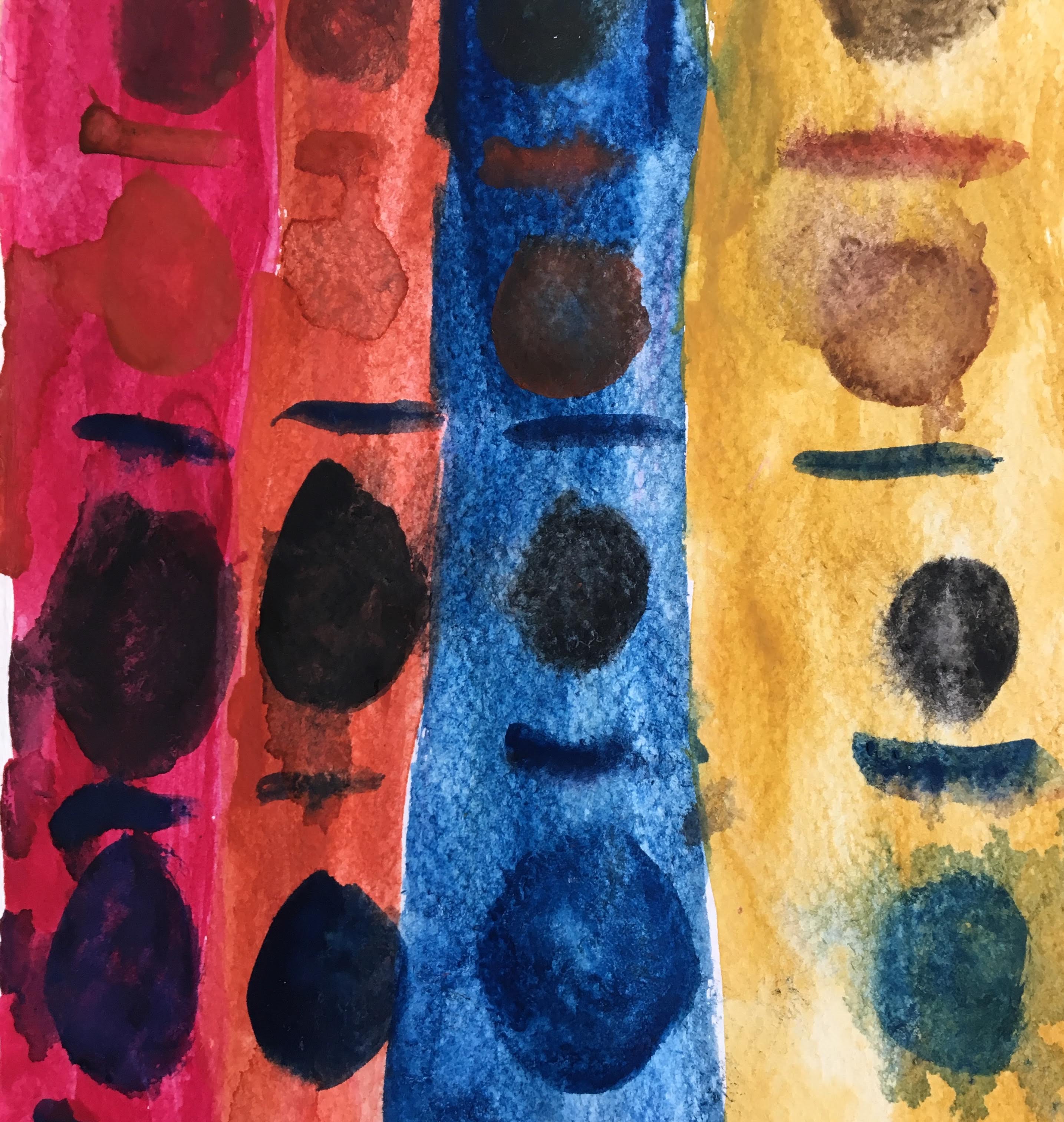
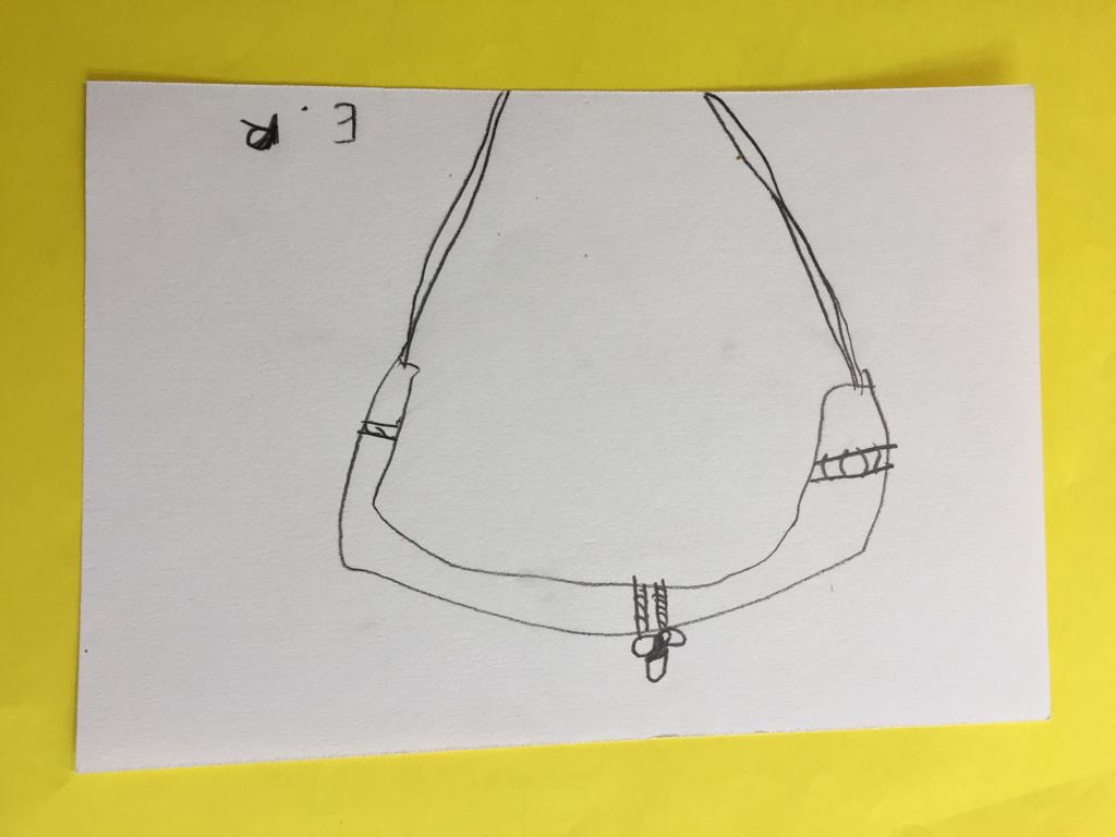
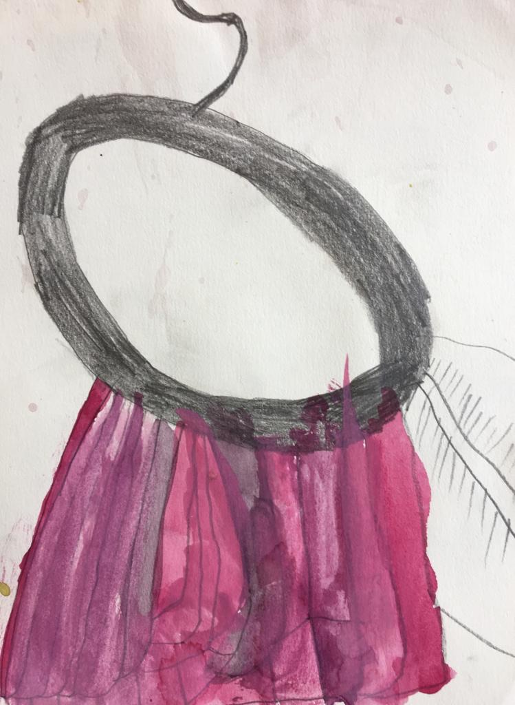
To practise playing with scale, we all took a tiny piece of jewellery and drew it to fill an A5 page, scaling it up to make it much bigger than it really was.
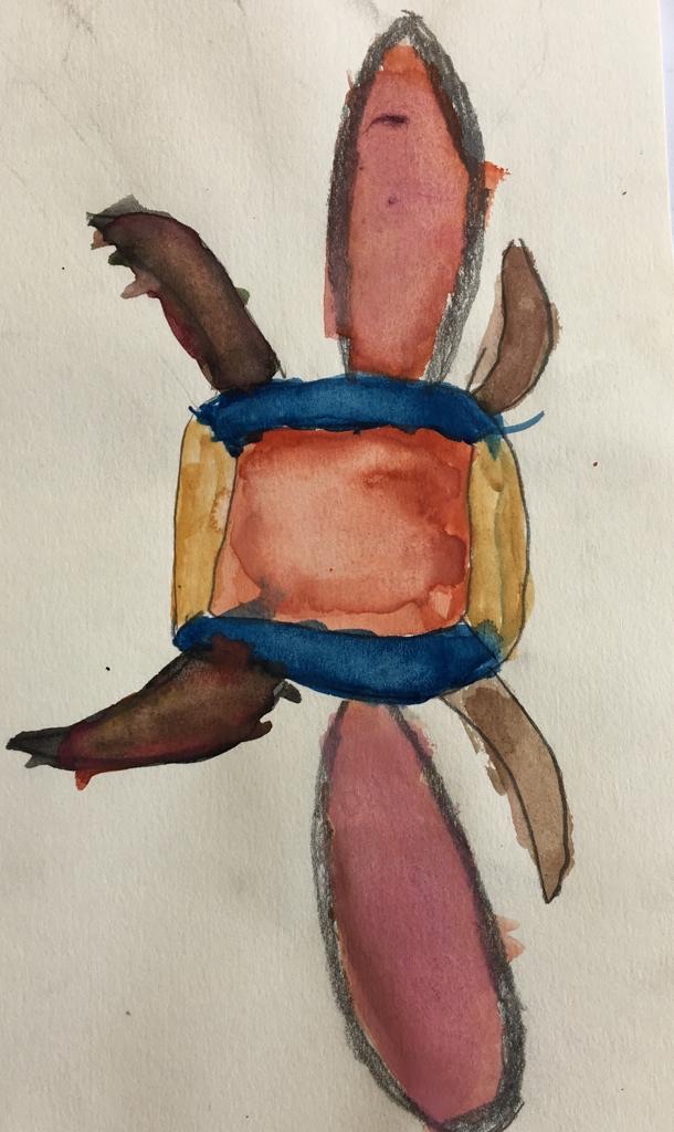 These rich bejewelled tones of semi-precious stones glisten on this insect-like broach.
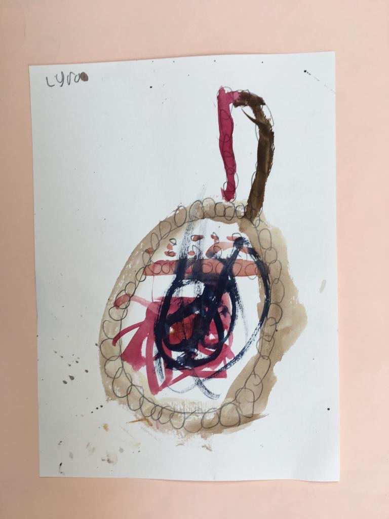 A small earring, blown up to become a colourful hoop.
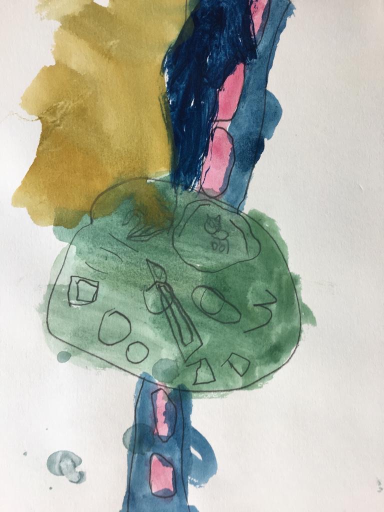 This colourful wristwatch has clearly marked details on the magnified face.
 This Indian silver hoop earring, has miniscule decorative elements.
 Here, the artist has clearly worked from life to depict the angle of the earring as it lay on the table before them. They have thoughtfully mixed manganese tones, to make shades of magenta.
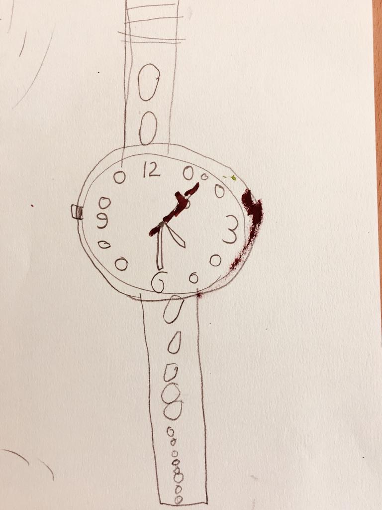 What clever use of graded scale in the decreasing circles on the strap of this wristwatch!
Click on the blue links above to learn more about the different ways to use scale and proportion in art.
- Posted by
 admin
admin - Posted in Children's Work, Courses, Creativity, Painting, Pelham After School Art Club, Uncategorized
 Jun, 04, 2019
 No Comments.
 Join Us On Facebook
 Join Us On Twitter
 Join Us On In.com
 Subscribe to Our Blog